Overview
The Global Citizen Education Group (TGCEG) is an education social enterprise that was founded in 2015 to bridge the gap in skills development and global citizenship education. With the goal of developing global citizens who will make positive contributions to the community around them and the world that they live in, TGCEG believes in using education as a platform for impact.
TGC has gone a long way since their beginnings, expanding their education line-up to not only include enrichment classes, but also educational trips, language skills development, STEM classes, and more. When I joined TGCEG, I was asked to give the current visual identity an upgrade, to better reflect the direction and the audience they are aiming for.
Why rebranding?
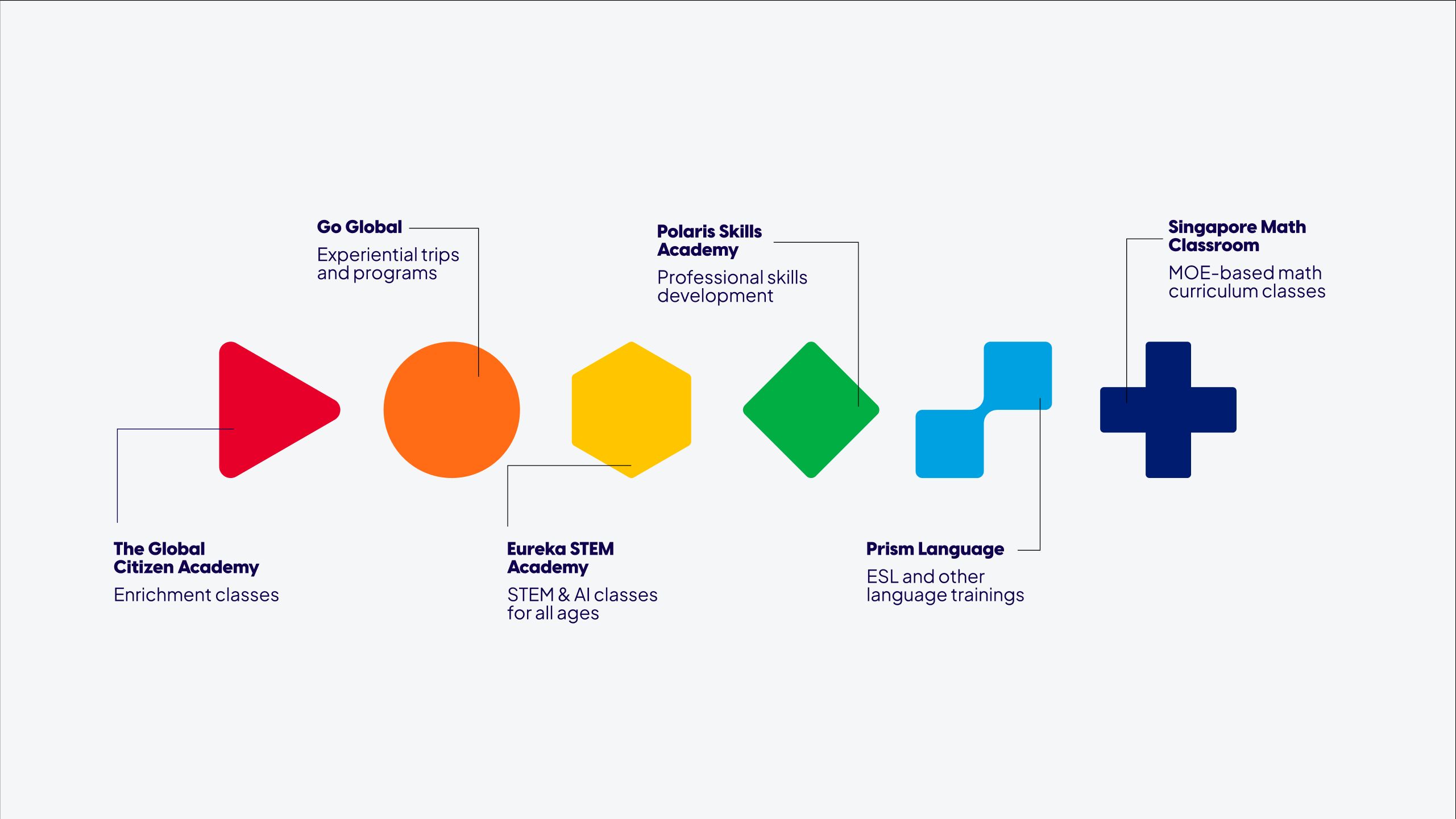
In 2023, TGCEG decided to add 2 more sub-brands into their current line-up, bringing the total number of brands up to 6. These brands span across different educational areas, and therefore require more distinctive visuals to differentiate them, while maintaining visual consistency of the main brand.
They also open up their target market from mostly B2B and B2B2C to do direct B2C as well. B2C customers are a lot more selective when it comes to choosing a trustworthy educational brand for their children, which is more a reason to make sure our brand refresh feels reliable yet approachable.
Color palette & Typography
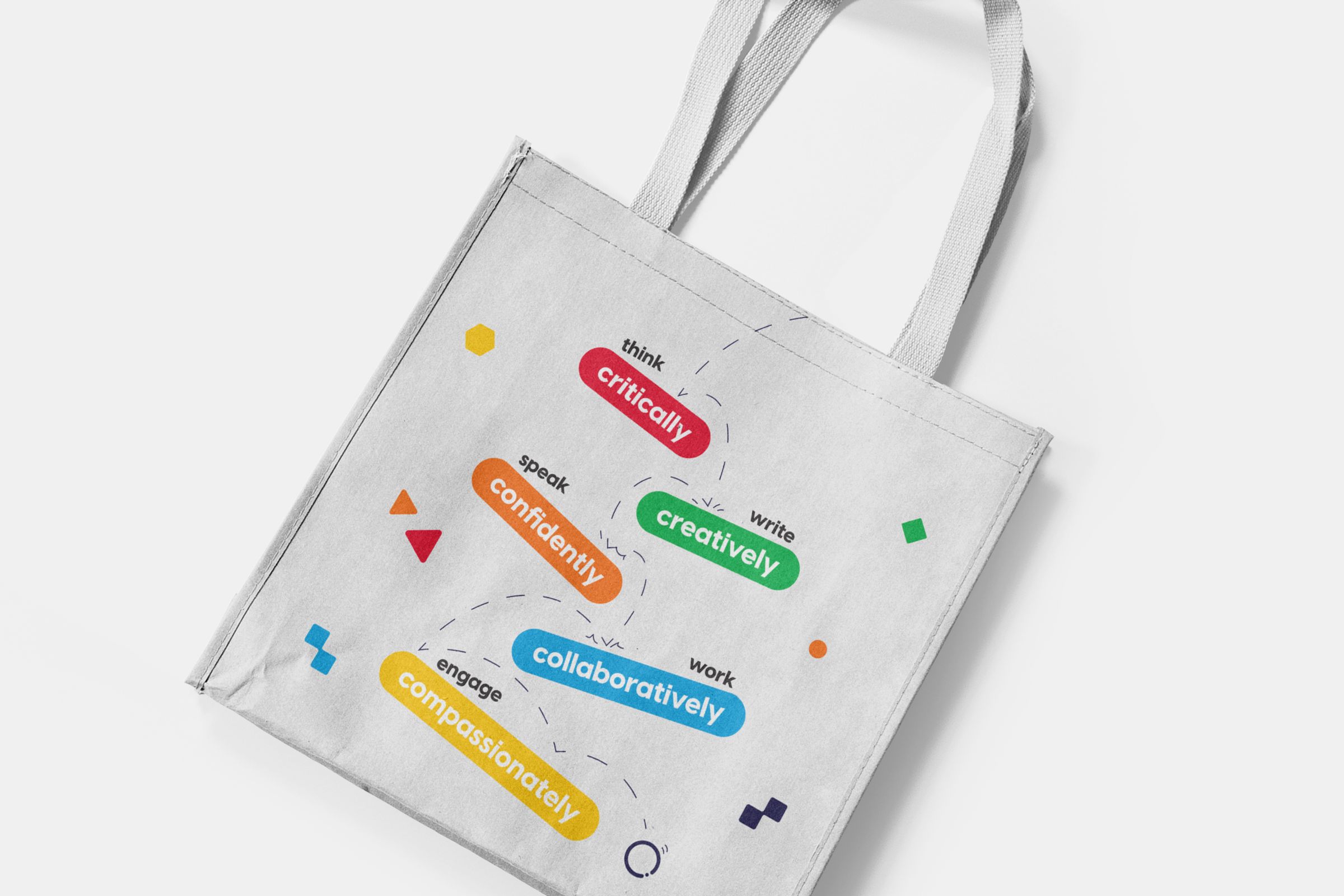
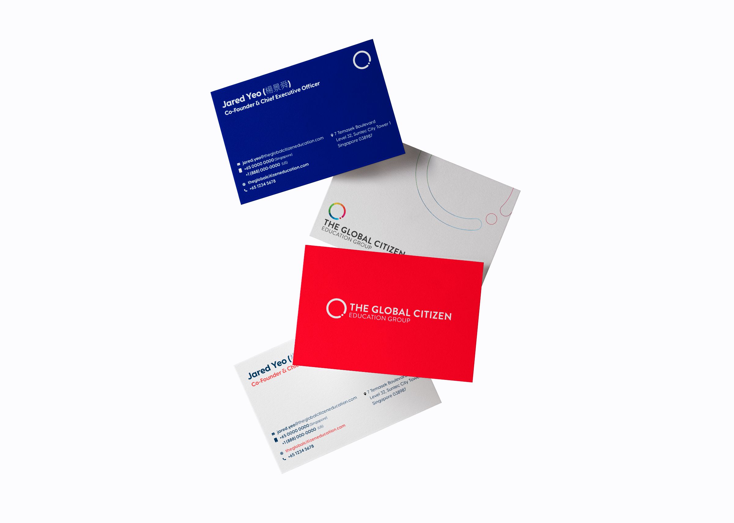
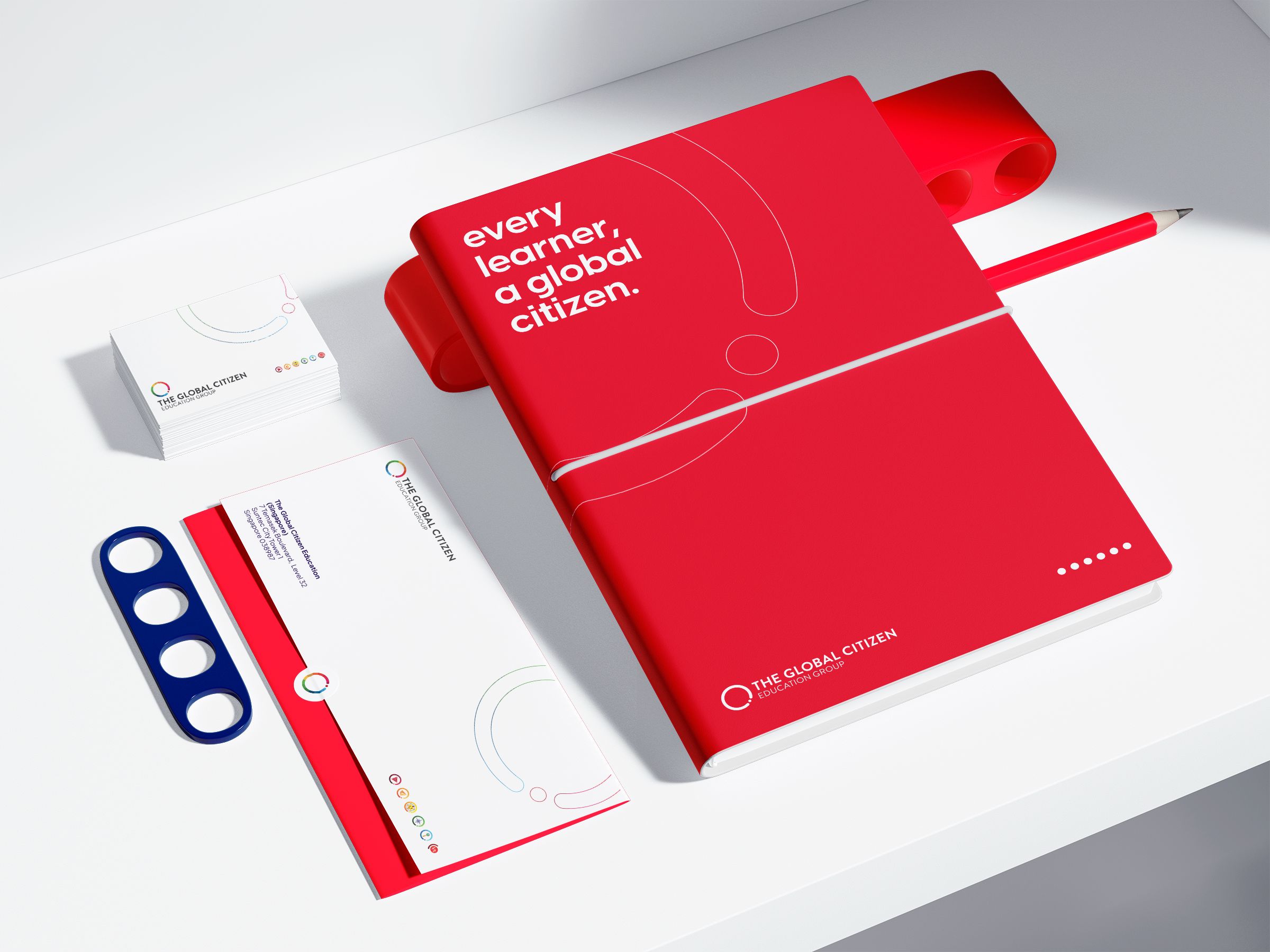
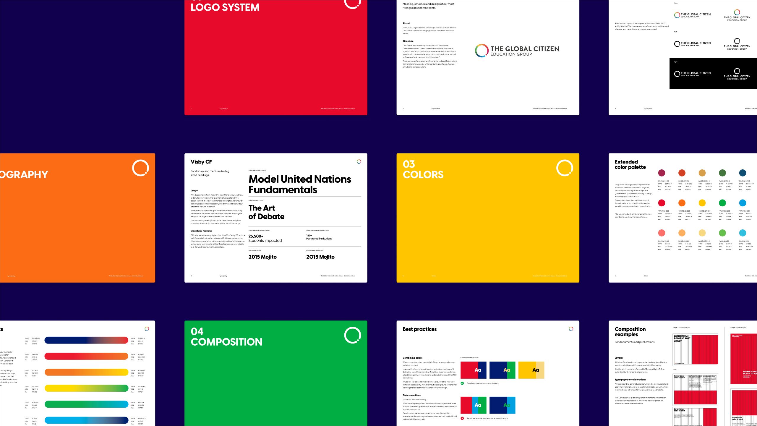
During discussions, we came to the conclusion that the old color palette lacked energy and was lacking in versatility. The new color palette introduced 5 different color groups with a range of shades and tints, allowing for a wide range of applications across not just brands, but use cases and platforms.
A set of two geometric sans-serif typefaces - Visby CF and Plus Jakarta Sans - were picked for their great legibility and the approachable feel they evoke. Together with the color palette, they help portray TGCEG’s mission to make global citizenship education accessible and for everyone.
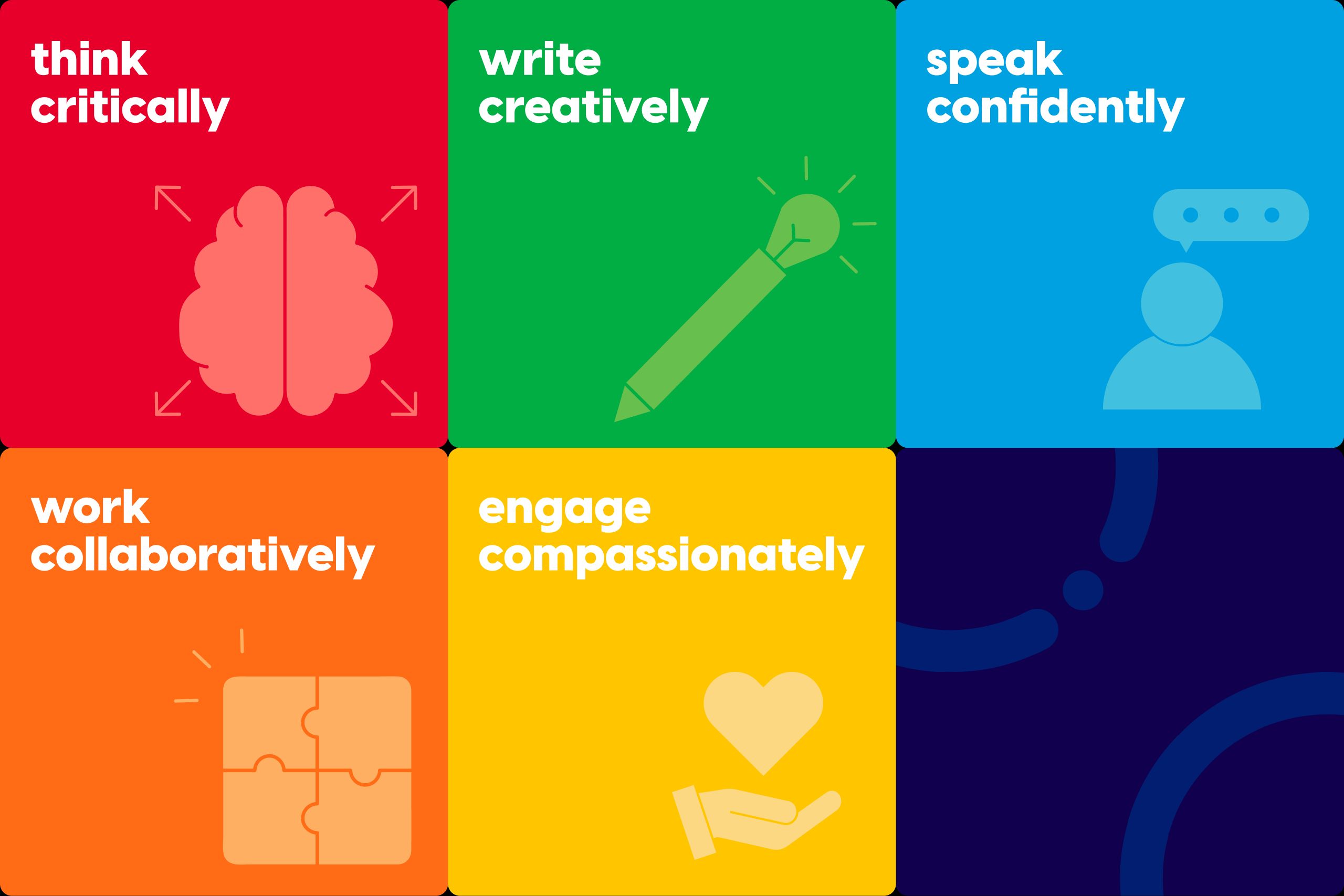
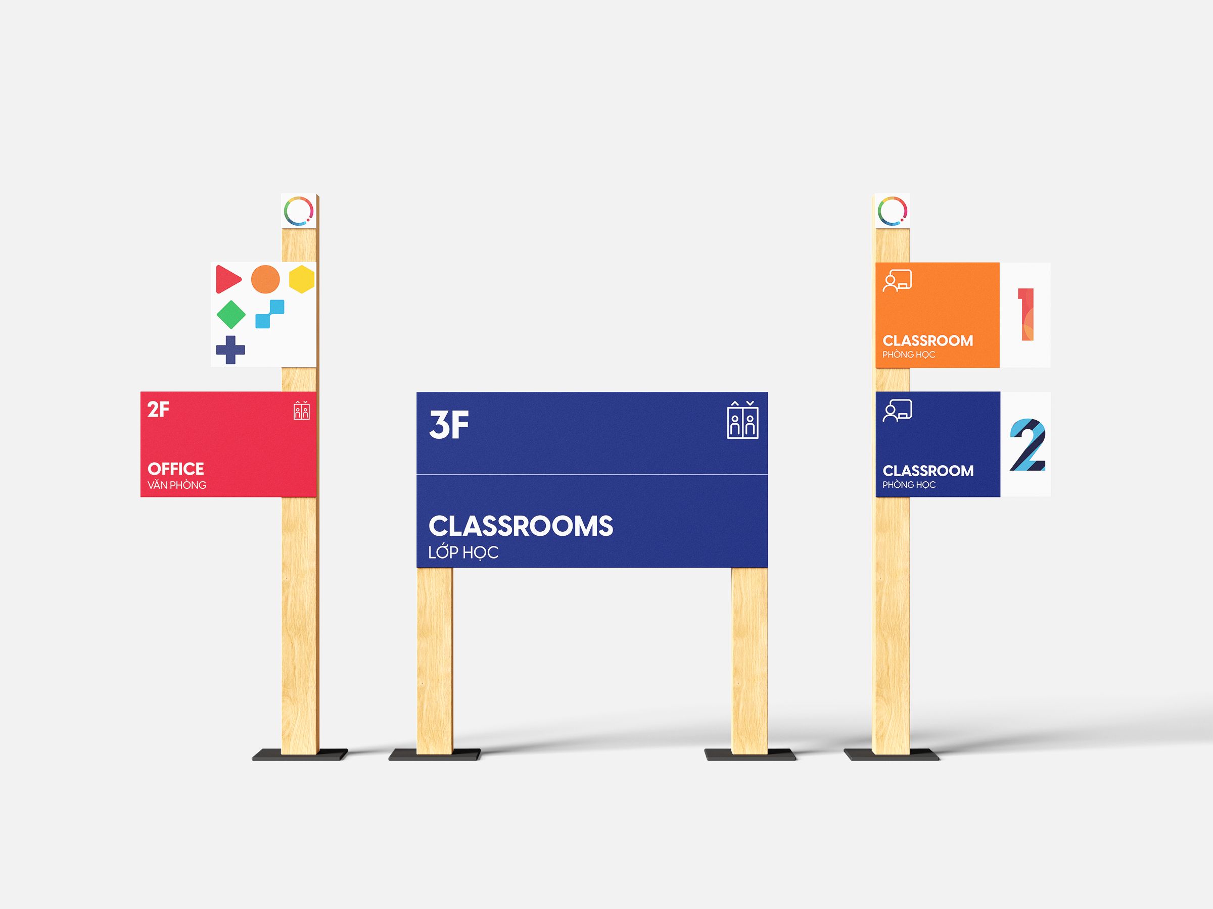
Graphic System
Following the same approach, TGCEG’s graphic system also reflects the variety of their programs. 6 different shapes were picked out for the sub-brands, each encompassing the feel of these brands. The rounded corner treatment for these shapes ties them together and makes the brand as a whole friendlier.